
About
Returning clients, Assumptions, were in need of another eye catching and intense magazine cover with the theme ‘Europe’ for their collaboration with The Review. The editors and I started a discussion and came with a specification.


Process
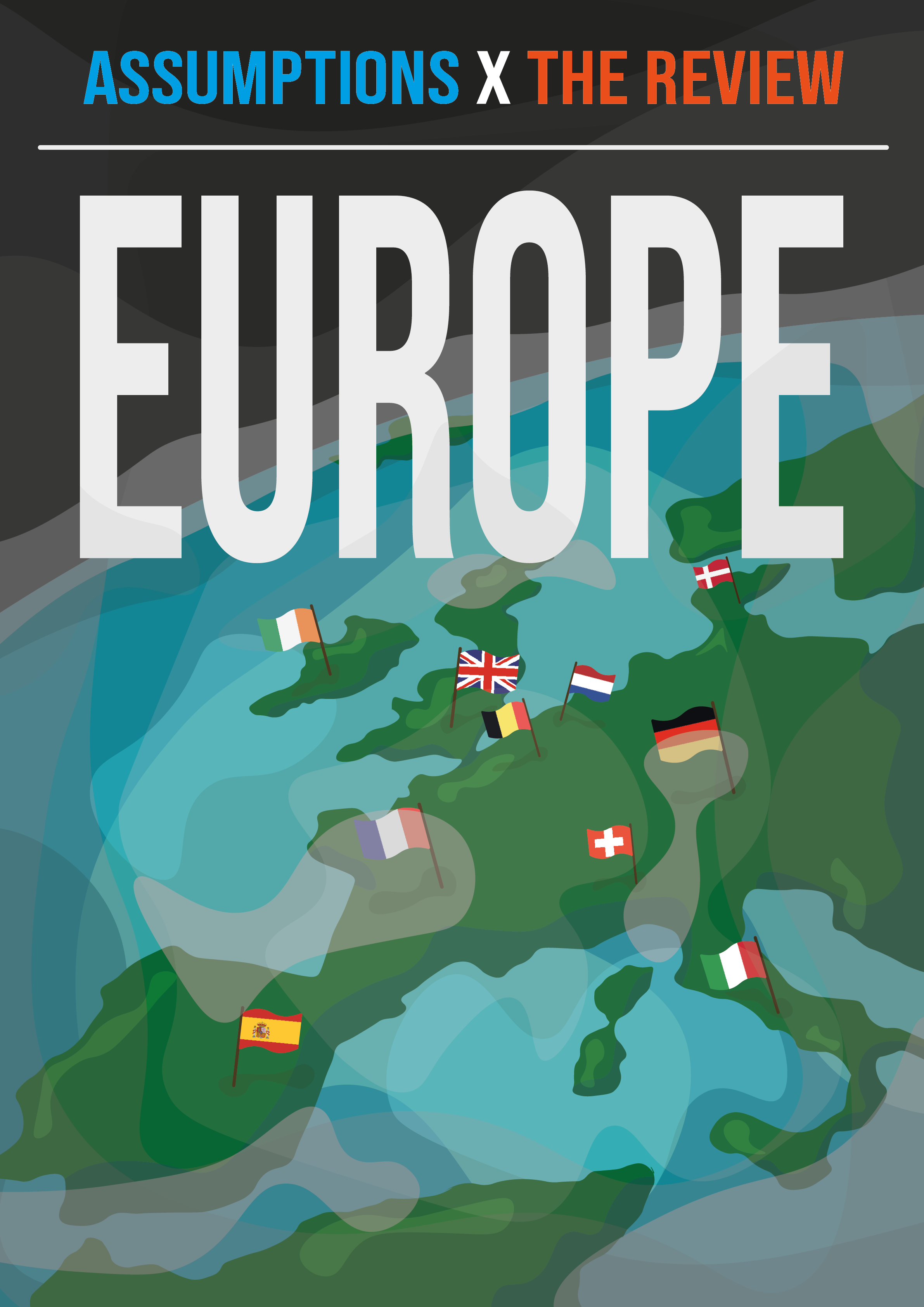
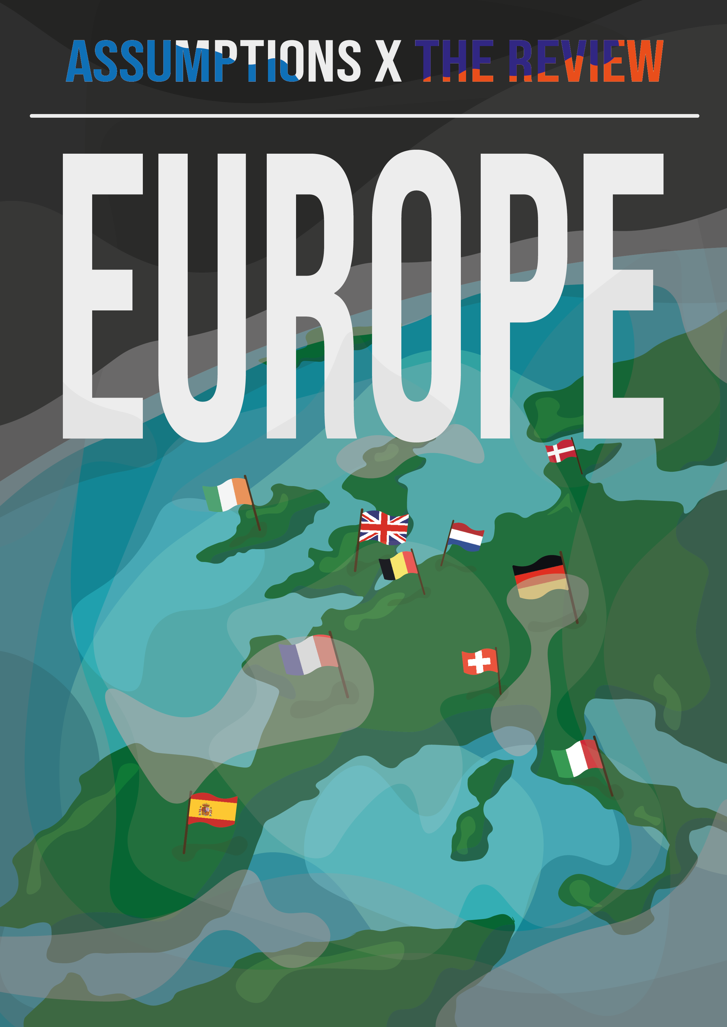
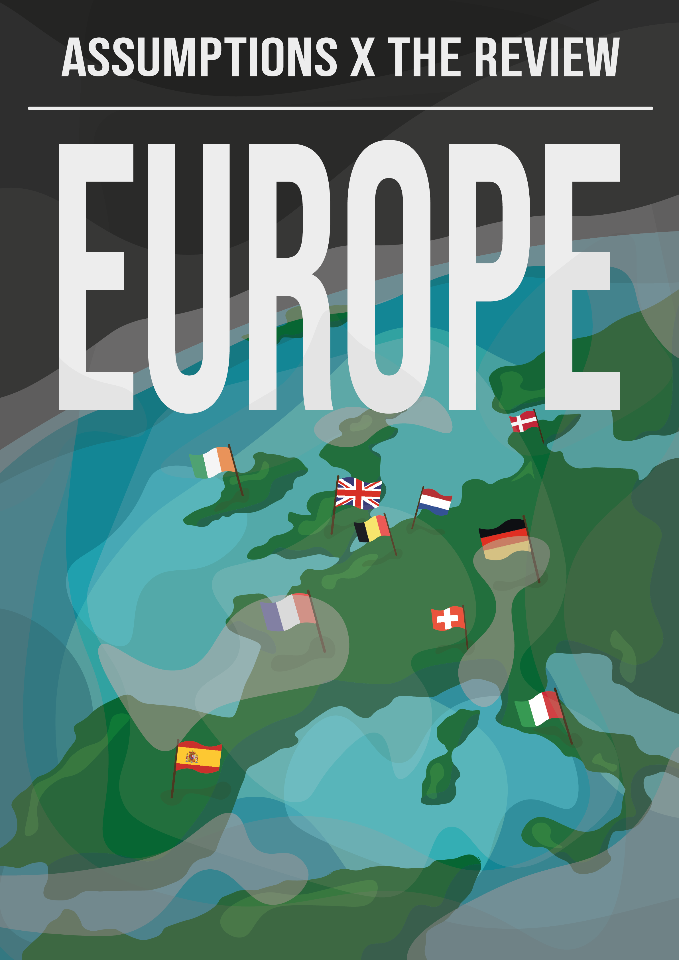
With some previous decisions already made, I continued to develop some concepts, narrowing down ideas to a map of Europe as it is not only identifiable but adaptable. With this I developed a small number of prototype covers with use of a variety of techniques to better understand what the client wanted from the cover.
Refinement
The art style came naturally as the original painted effect gave a gritty feel. We then we returned to a clean cut vector graphics that allows for a playful yet still out of this world view. With use of the countries silhouette and the flatter globe, taken from previous concepts and ideation sessions, the outcome can then be defined, the minor details can be refined, allowing a finalised version that can be exported.
Outcome
The outcome produced a dark but dramatic magazine that resembles the view from space. The use of the branding colours allowed each Society to represent themselves in this collaboration.
Assumptions x The Review Term 2 Magazine Cover and Assets by Jacob Cave | Spring 2020 | Warwick Economics Society’s Magazine Assumptions and Finance Societies’ Blog The Review